Sony PlayStation Hyperpop
Approach
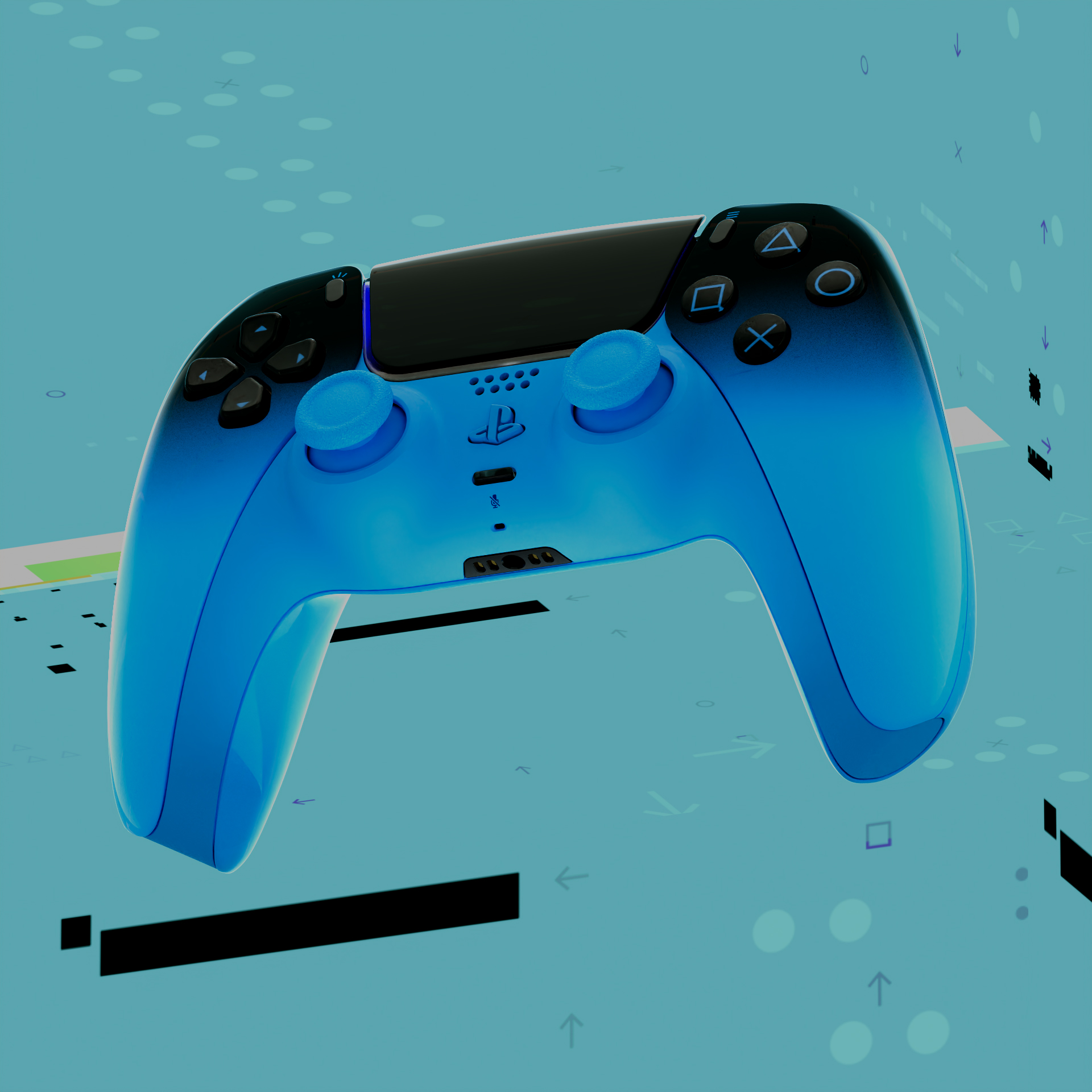
PlayStation already has a strong visual legacy, so the challenge wasn’t just making something attention-grabbing. It was about pushing the Hyperpop direction in a way that still felt distinctly PlayStation.
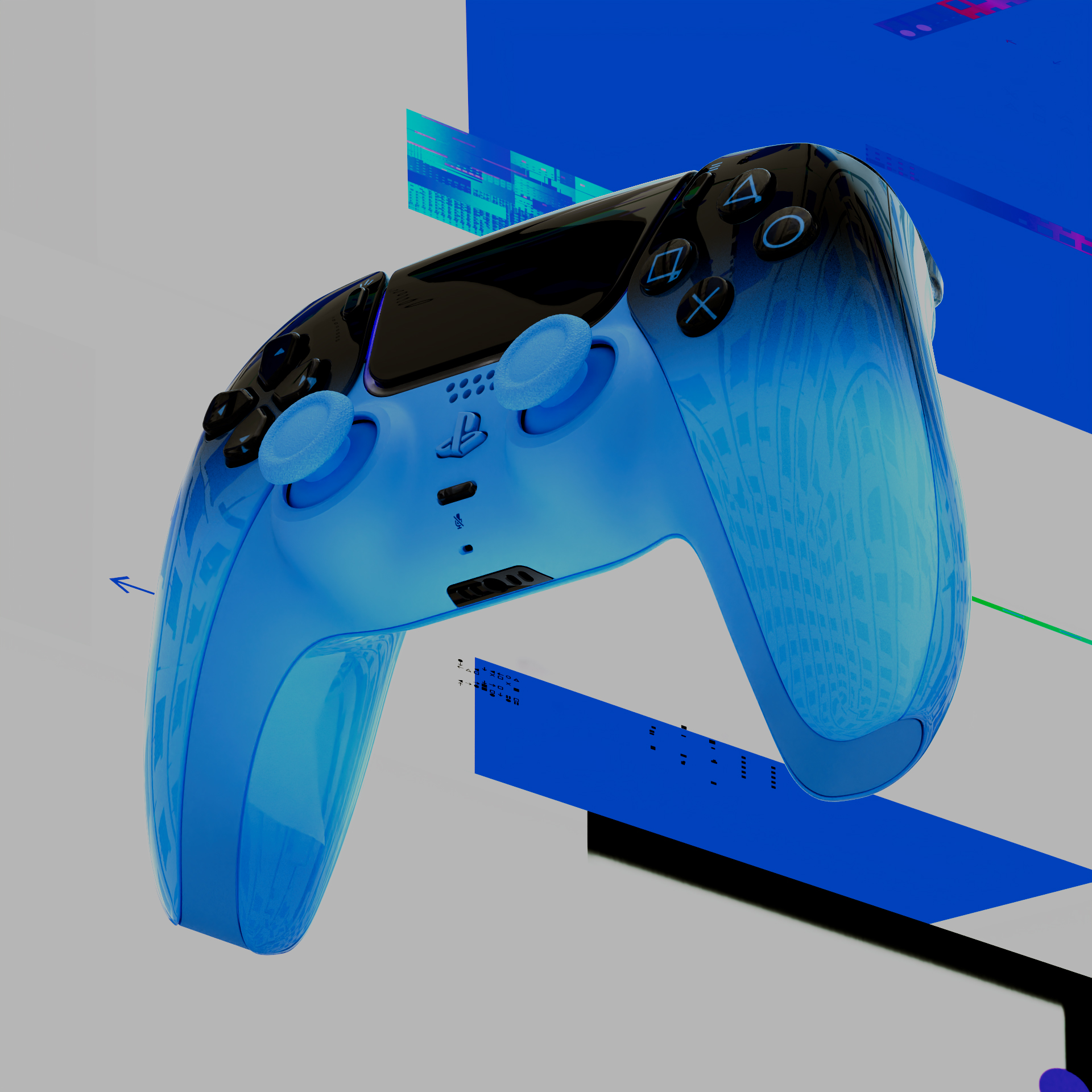
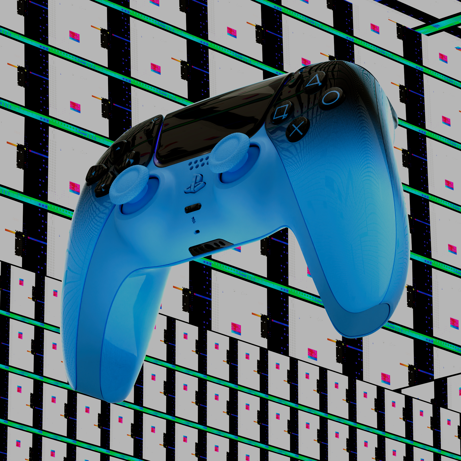
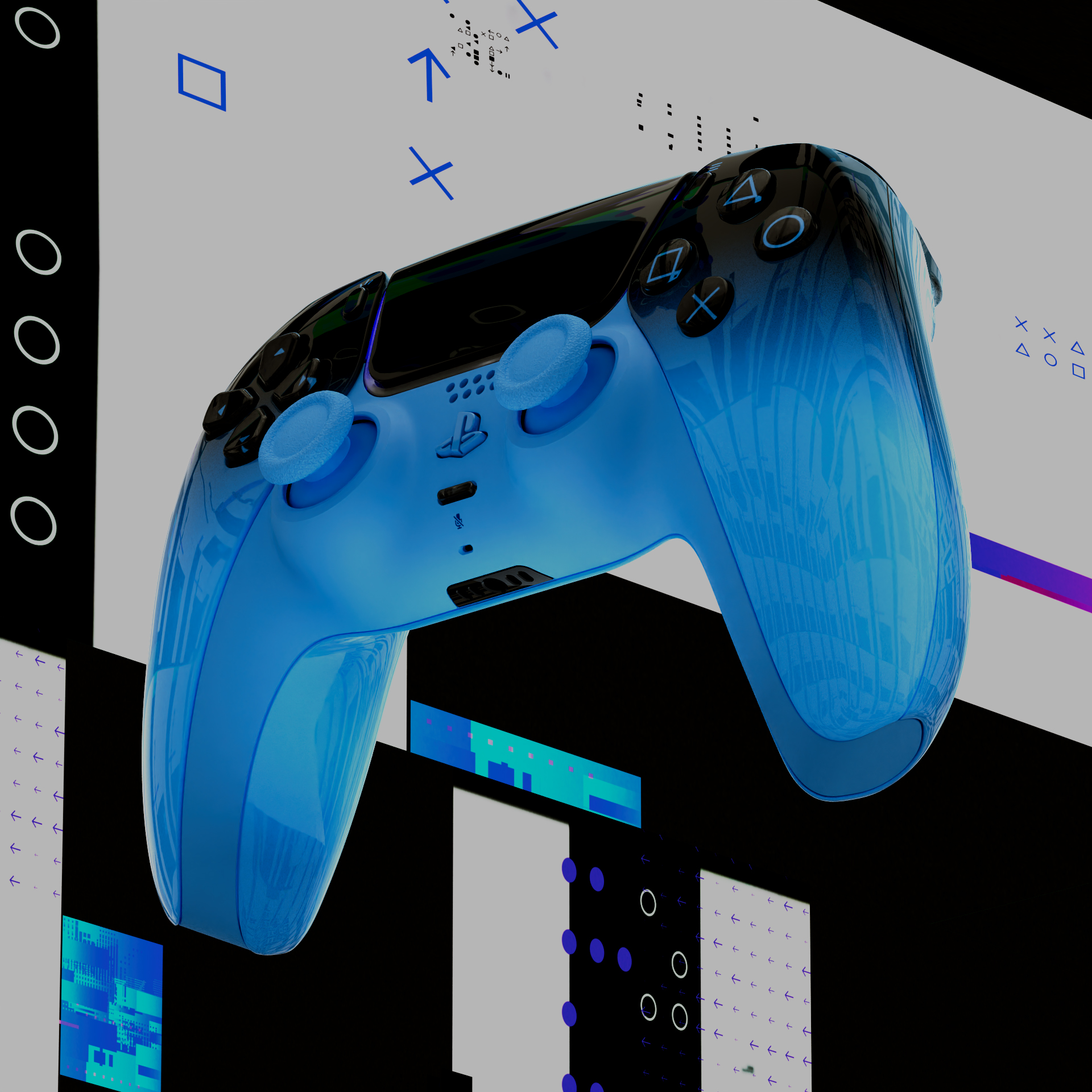
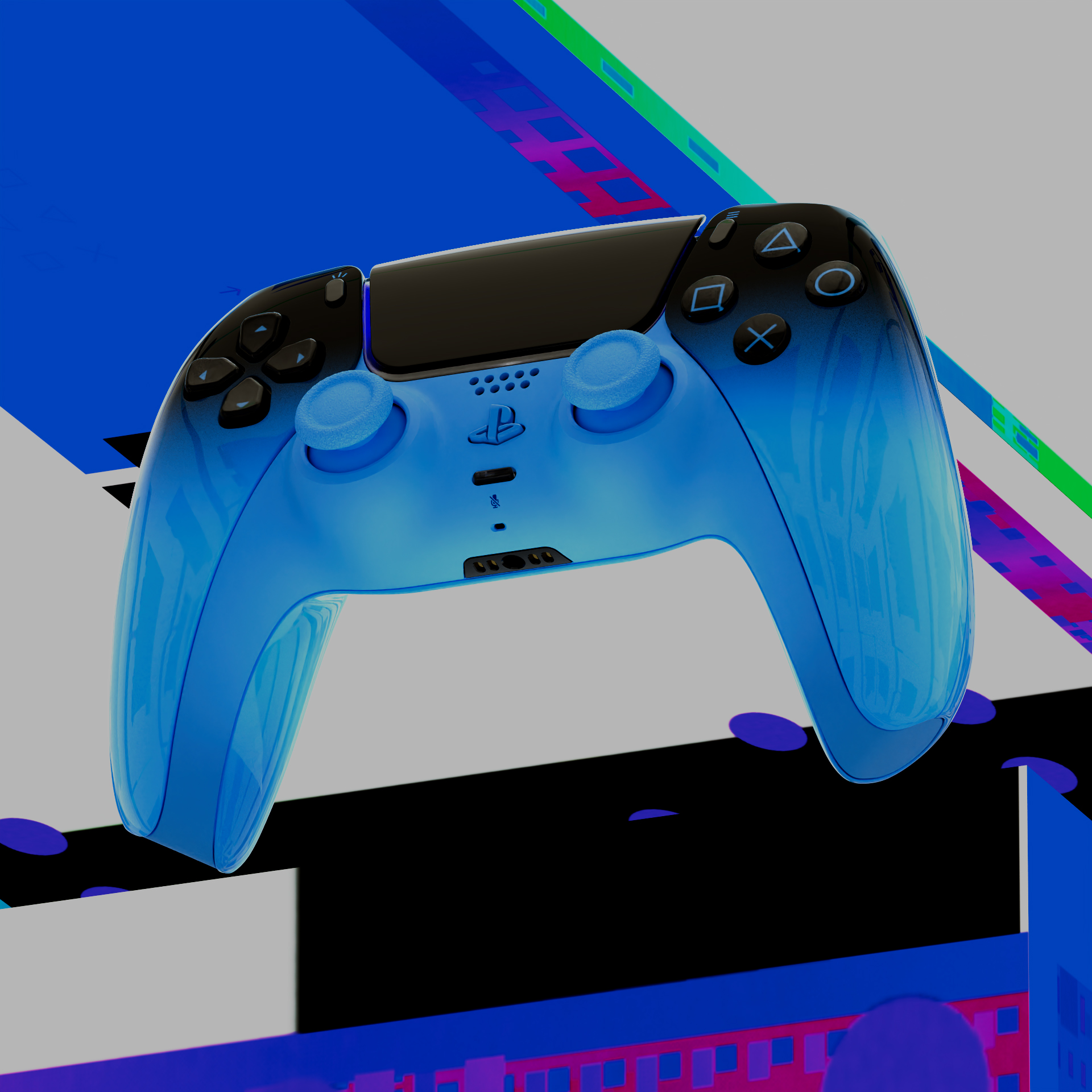
Working with the team at Imaginary Forces, I helped shape a visual language for the new controller and console colorways. Building design systems that could hold bold color, graphic contrast, and motion without losing control or cohesion.
Visual World
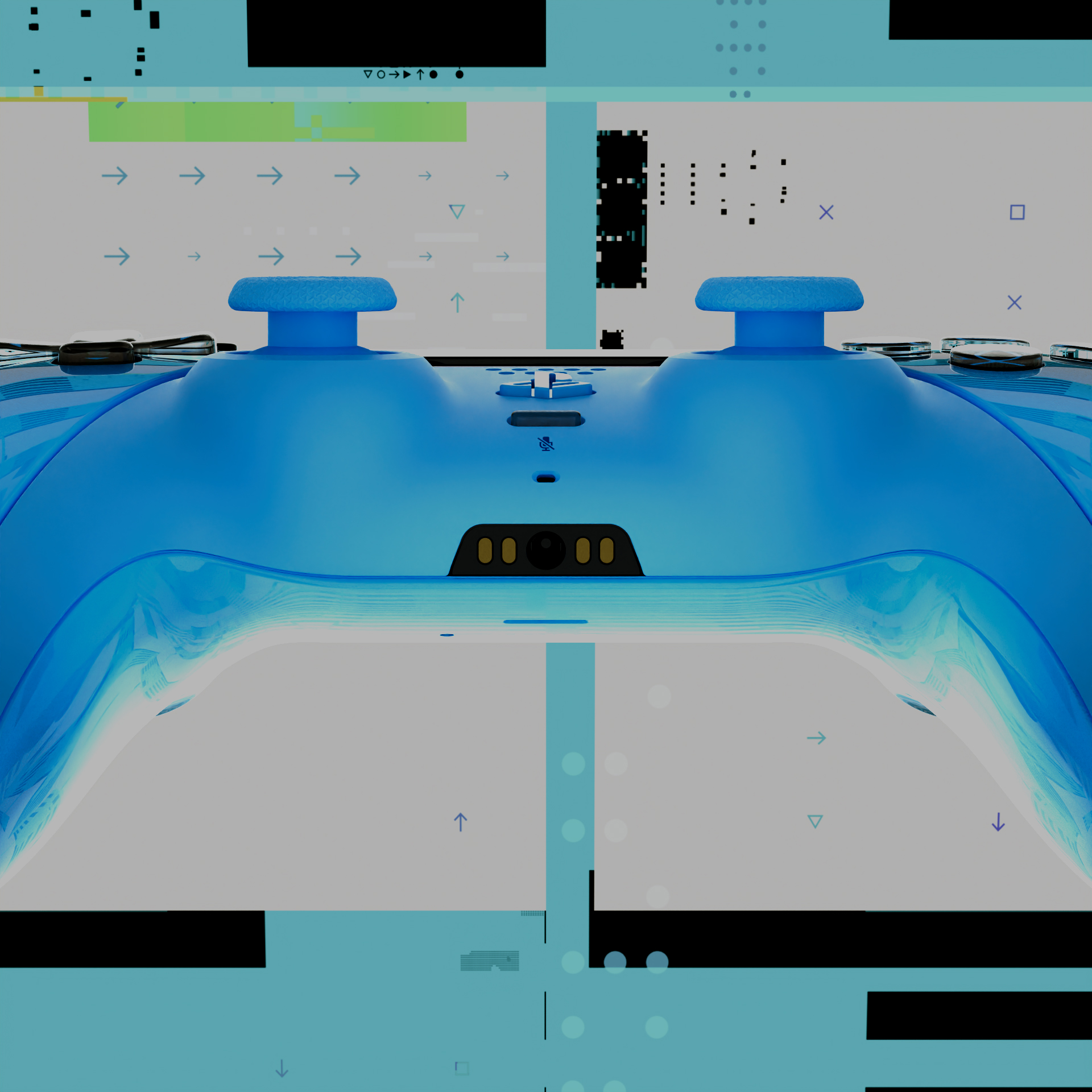
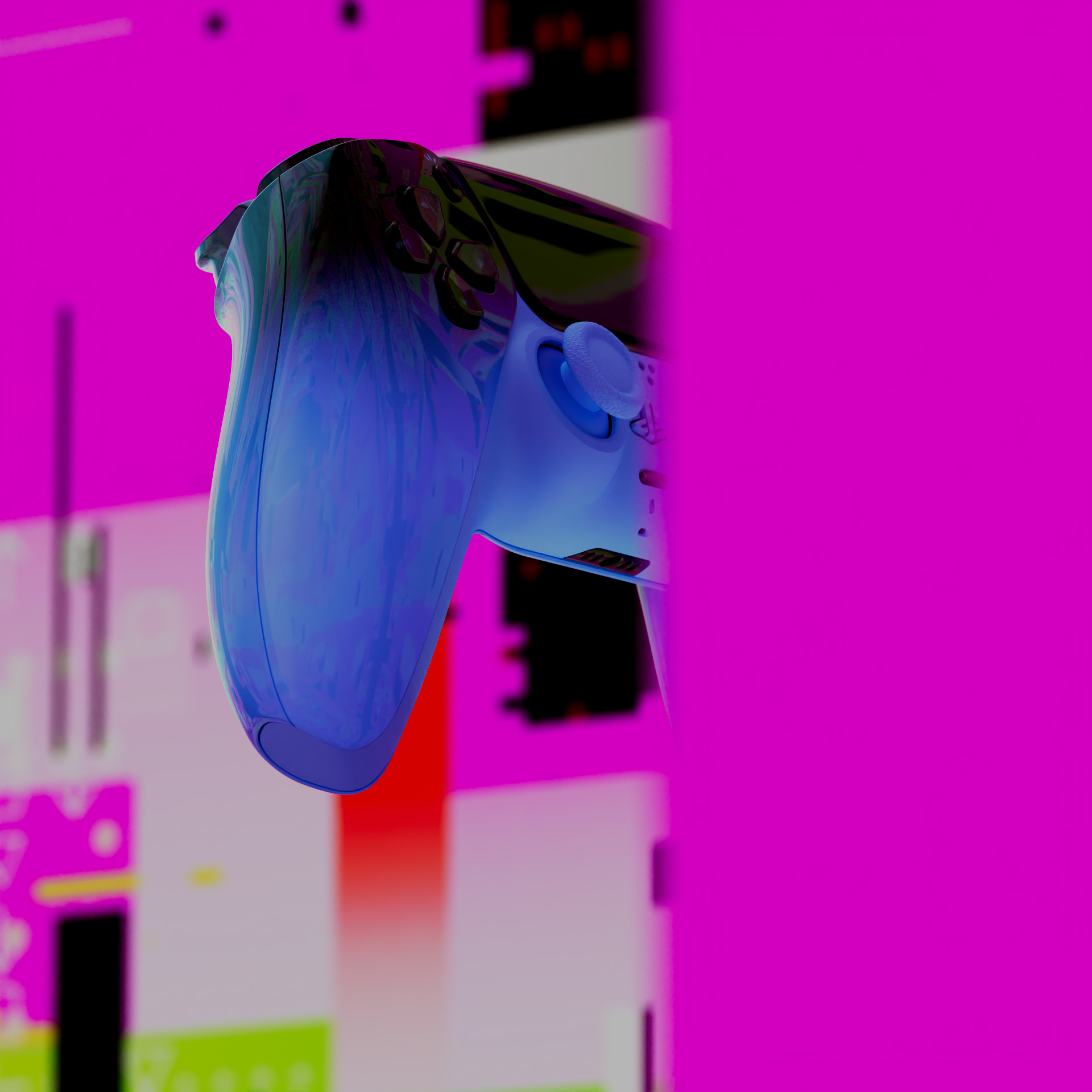
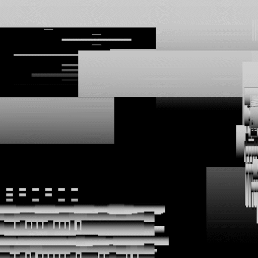
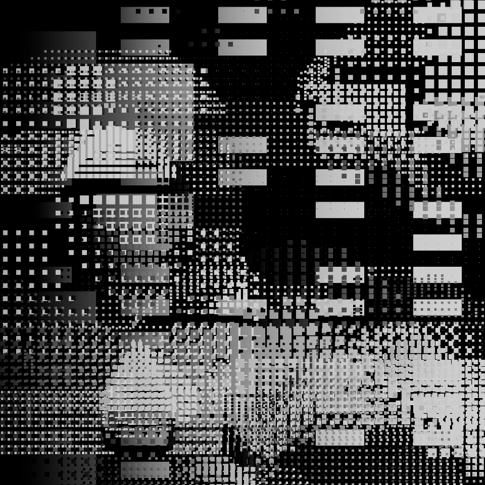
The world was built around the tension between poppy colors, flat 2D graphics wrapped on 3d dimensional and infused with glitch overlays to drive pacing and energy. That contrast helped give the piece its vibe, but the real focus was making sure everything felt unified rather than over-styled.
Developing the package as a system instead of a collection of individual shots, allowed the visual language to scale across the three main colorways while still giving each moment its own identity.
Design Development
Early on, much of the work centered on balance. The graphic world needed enough density to feel alive, but enough restraint to let the controllers and consoles hold their presence.
That phase was less about locking a final look and more about calibrating how much visual information the system could carry. Testing where energy helped, where it distracted, and how the graphics could frame the product instead of competing with it.
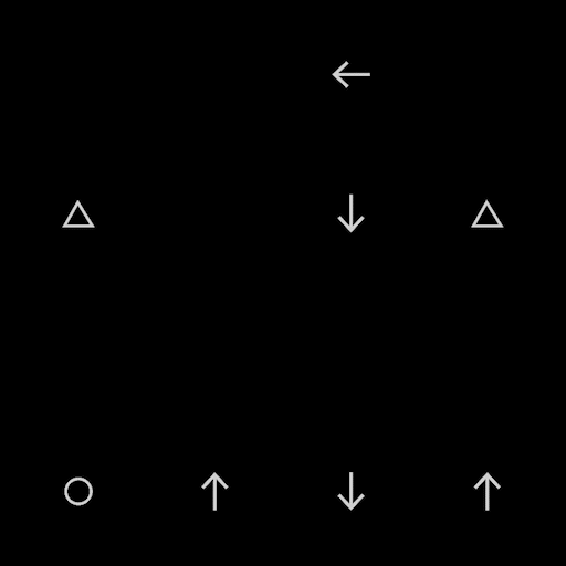
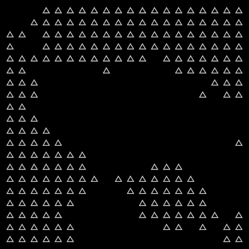
Glitch Language
A large part of the process involved building procedural setups that could generate variation without losing consistency. Pulling inspiration from PlayStation’s visual world, we developed a flexible graphic library that could adapt across different forms and uses.
Those elements moved through the piece as textures, overlays, and transitions. Creating bursts of energy that helped drive pacing while keeping the overall system cohesive.


Role
Art Director | Designer | Animator
Produced at Imaginary Forces